How to Choose Brand Colours for Your Website
Good websites use fewer colours than you think: one brand colour, one accent and calm neutrals. Here's how to pick them and keep text readable.

Colour is often the first thing people notice about your website, and the first thing many business owners get wrong. A site with six bright colours looks busy and cheap. The most professional sites use a small, calm palette and let one colour do the work.
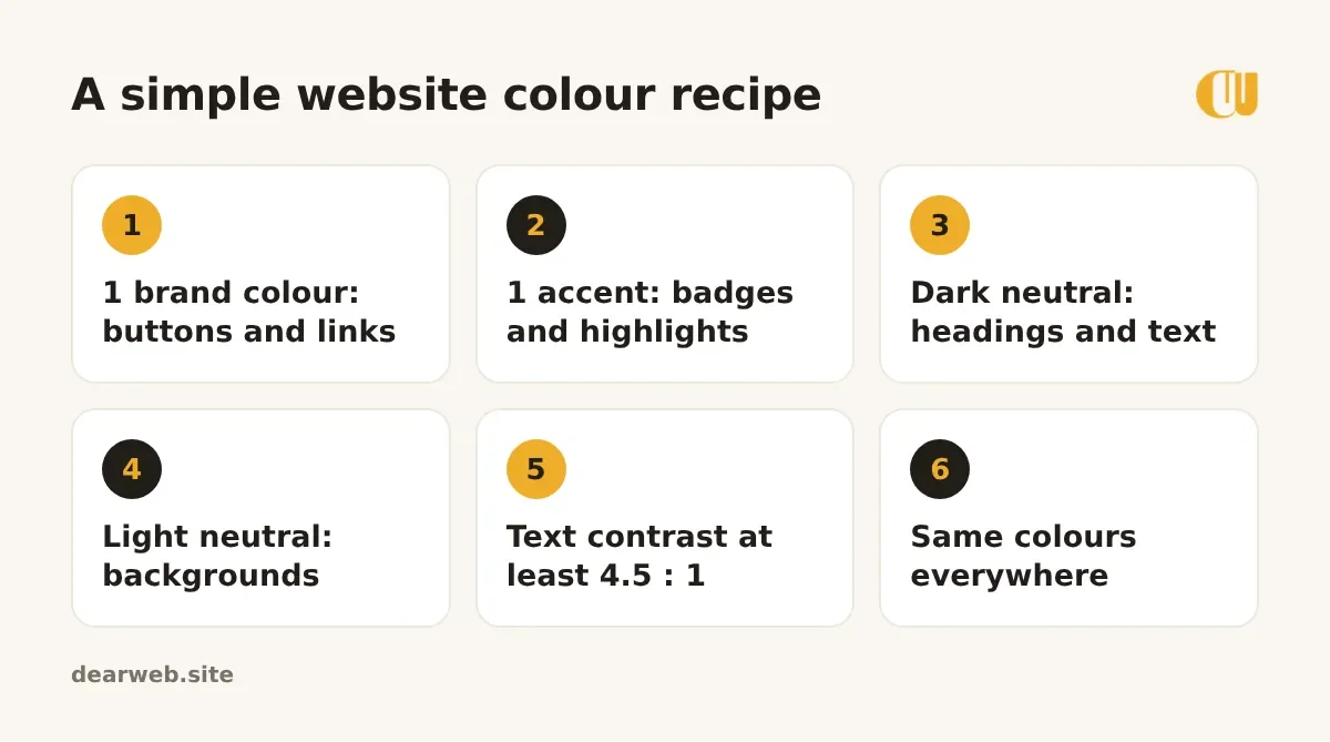
The simple recipe
1. Start from your logo
Your main brand colour should usually come from your logo. If you don't have a logo yet, choose a colour that fits how you want people to feel: blues and greens feel calm and trustworthy, warm oranges and yellows feel friendly and energetic, deep colours feel premium.
2. Use your brand colour for actions
Use it for buttons and links, the things you want people to click. When the brand colour appears only on actions, visitors learn where to tap without thinking.
3. Add one accent
An accent is a second colour for small highlights: a "New" badge, an icon, a line under a heading. Use it sparingly.
4. Let neutrals do most of the work
Most of your page should be white or a very light tint, with near-black or dark grey text. Neutrals make the brand colour stand out.
Make sure people can read it
Light grey text on white, or white text on yellow, looks stylish in a design file and is unreadable on a phone in sunlight. Web accessibility guidelines recommend a contrast ratio of at least 4.5 : 1 for normal text. Our colour palette generator checks this for you.
Common mistakes
- Using a different colour for every section.
- Coloured text for whole paragraphs.
- Bright red for anything that isn't an error or a sale.
- Changing colours between your website, social posts and shop sign.
Write your colour codes down (for example #EFAD29) and use exactly the same ones on your website, social media templates and printed materials. Consistency is what makes a brand recognisable.